Pages

Thursday, December 31, 2009

In Search Of The Unknown: The Illustrated Story of a Doomed Expedition

One of the things I loved about the classic TSR D&D adventure modules were the illustrations. It always seemed to me that the illustrators would tell a tale of the dungeon delvers within the pages of the module; tales of treasure, monsters, dangers and death.

Many player's first module adventure was B1 In Search of the Unknown and the tale told in those David Sutherland III illustrations is of classic D&D flavor.

You'll see that we have our trusty wizard, complete with pointy hat, along with his young and inexperienced adventurer seeking men of arms to delve the mysterious Quasqueton in search of Zelligar the Unknown's mystic secrets! Yes the risk is great but the challenge cannot be ignored!Having banded together a diverse group of adventurers and with spirits high, the party sets off to find the fabled 'Q' on the wizard's map. What can possibly go wrong with such a hardy group such as this? Archer? Check! Dwarf? Check! 10 foot pole? Check! Note the full fantasy flair of the shining knight and the fairy castle. Ahh, those first few years of of RPG innocence.


After days of travel and searching, a heavily forested hilltop pokes through the trees and a lone watchtower is spotted. Could this be the fabled Quasqueton? Note that this little remembered fact about a watch tower has, surprisingly, never been expanded upon from any one of our creative Grognards.
UPDATED: Restless corrected me on this assumption and posted this link to the tower.


An initial foray into the chambers and corridors under the mountain reveals some tantalizing trinkets but, alas, the treasure was but an illusion broken by a touch of the hand.
Upon seeking the exit, our first group of adventurers discovers a most extraordinary find. A chamber filled with a rainbow of molds and fungi! What wonders this deserted stronghold hides. Tomorrow a delve deeper into these depths!

The second foray into the mysterious stronghold of Quasquenton unveils more of it's mysteries! A wizard's laboratory! A cat suspended in a jar? Wait! Don't open that!

A wrong turn and our party is trapped! Strength alone will not save them. 'Tis the skills of the tiny halfling who escapes and finds the trigger to open the portcullis.Out of the shadows battles are fought. Our party is whittled down to four souls. More corridors explored and doors opened. An expansive room filled with mysterious pools. What's that sound!?!

More horrors wandering the halls! Down to only three now. Give up? What of Zelligar's secrets? Just one more door.....
Plummeted to the caverns below, trapped and hopelessly lost, the party faces horrors unimagined! One by one the warriors all fall until the lone wizard is left searching in vain for the way back to the surface. Doomed to his fate the wizard faces his final foe!
Okay, so a TPK. What more did you expect from a bunch of 1st level explorers?

Wednesday, December 30, 2009

It Was 30 Years Ago...

Has it really been that long? Indeed, it has.

The Christmas of 79' brought memories of the monstrous Chicago blizzard from earlier that year and delivered to me the next evolution in my gaming history.

Yes, that started with TSR's Dungeon Master's Guide. I didn't know what I was getting myself into. And despite my falling math grades (I was just drawing dungeons in class) my parents picked up the guide that set a standard for all rule-books to come.

I was looking forward to the "Advanced" version of the game, that's what everyone was moving towards at the time. I even had the TSR S2 module 'White Plume Mountain'. Though I had been playing Holmes 'basic' for the past year and playing it wrong for the first six months, I felt that it was time I moved up with the big boys, I felt that I was an 'Advanced' D&D player.

Well, of course, as a youngster, I was overwhelmed with all the rules. What I think I really wanted was the Player's Handbook which had details of all the different character races and classes. But I was, at this time, still acting as DM for my friends who were just starting to follow my lead so it was the DM guide for me. The hard book cover screamed "I'm an Advanced gamer now, so enter at your own risk!"

Though the 1st ed Advanced books are fantastic and classic aspects of the game, I have always found those rules to be too heavy. I would always go back to Holmes, sprinkling a bit of the Advanced rules in here and there. The simplicity of the rules are what kept me there. We played D&D religiously the next year, but 1980 would introduced new games to my universe.

Tuesday, December 22, 2009

Campaign Creation: Map Making Tutorial Part 4

Okay, so now after all the hard work from the last 3 tutorials (part 1, part 2, part 3), the real fun begins. We're going to add the final touches to your map to really spark your players imaginations. Once again, we'll be using GIMP, the free open source image manipulation application to wrap-up our map project. If you have access to Adobe Photoshop, you can use that app as well. The methods and techniques will be very similar.

In tutorial 3, we went over a number of GIMP's features that helped you enhance your hand drawn map. We'll be using some of them for the final portions of the map. I'll cover some in this lesson but you may want to go over those techniques in lesson 3 if you haven't already.

The first thing that you want to do is open your flattened map file that you created in lesson 3 into GIMP. This flattened file will include all the text and the hand drawn, inked map background all on a single layer.

In your layers pallet, you will want to change the name of the layer from Background to Map. This way, we can add layers beneath the map layer as well as above if need be.

The next thing you want to do is to change the mode of the map file from Grayscale to RGB. To do that, go to Image >> Mode >> then select RGB. Your map is now ready to accept color information.

You are now going to add the paper texture background to your map. Download the image file to the right by clicking on the image so it opens on it's own, then right-clicking select Save Image As... and save the image to your desktop. Open that image in GIMP. Copy the image and paste it into the map file. When you paste it into your map file you won't see it right away but a new layer will be created called "Floating Selection (Pasted Layer)". Double click on that layer name and rename it 'Paper Background'. You should now see the paper texture. You can resize and position the paper using the scale tool, rotate tool and the move tool as needed.

After you have scaled and positioned the paper texture to fill the map area you want to move the Paper Background layer below the map layer. Now select the map layer and under the Mode drop-down menu select Multiply. You will now see your map drawing on top of the texture paper background. Already things are looking pretty good, right?

We're going to add a little color to the map to give it a hand painted appearance. Each color element will be on it's own layer. We'll start with the coastline. I like to add the color of water along the coast and lake shores. Select the Airbrush tool, then choose a fill color from the color pallet. Create a new layer and call it Coast and place it below the Map layer but above the Paper Background layer. With the Coast layer selected, choose Multiply from the Mode Drop-down menu once again. Now adjust the brush scale and begin painting along the coastline. I like to paint just the area of the ripples that I drew along the coast. You're painting doesn't have to be perfect, in fact, the more loose you are with it, the more handmade it looks. Using the Airbursh tool in this way can give a nice watercolor look to the colors you add to the map. You'll also notice that the texture of the background paper shows through the color as well when you have the layer mode set to Multiply.

Keep working your coastline and don't forget your river inlets, islands and lakes, altering the brush scale as needed.

Now, repeat this technique with other color elements such as forest or jungle, mountains and hills, whatever your imagination comes up with. I use the paper texture background as the general color of the land masses and just add color highlights. For example, at this scale, I didn't add any forests or jungles by hand, but instead I will add the colors to represent those areas. Again, I may have to adjust the opacity of a layer to get the right effect.

For the mountains, I use a gray tone and fill the shadowed area on the left side. Remember things don't have to be perfect, in fact the less perfect they are the better. It gives it that hand painted quality. Also note that all the colors are below the black outlines of the map. Those black outlines will cover any odd coloring 'out of the line' marks that you make.

Color in any other details that you've added to your map and with a little work, you can have a great prop to hand to your players. Below is my completed copy of the campaign world map.

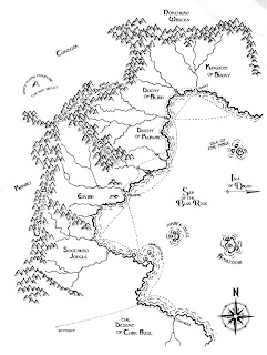
Now, at this scale I get a pretty broad view of the lands, but my campaign is beginning in the Region of Eir'ian. So I followed the same techniques in these tutorials and created a detailed map of just that area.
You may notice that in this scale, I added 'trees' for the forested areas and additional towns and labeled areas of interest. This was going to be the map that I hand to my players but after a couple of sessions I realized that these level 1 grunts weren't going to need all this land to explore for quite a while so I 'zoomed' in a bit more and created this map:
This represents a tighter area of exploration that my players may actually get to. I focused more on the details of the smaller scale, again adding more areas of interest, towns and ruins. This is the main focus of my sandbox campaign but if I need to expand it then I have a general idea of what is out there. That is my argument for a top-down approach to map making/world building/campaign construction. All of these later maps were created using the same methods that I explained in these 4 posted tutorials.

I hope you found some of these hints and methods useful and I hope you use them in your creative campaign endeavors!

Start over with Part 1

Monday, December 21, 2009

Dan O'Bannon, Alien and Intruder

This past Saturday, over at Lamentations of a Flame Princess, I learned that screenwriter Dan O'Bannon passed on. I grew up with many of his films including Alien, Heavy Metal and Dark Star, which he made with John Carpenter and Ron Cobb (set designer for Conan the Barbarian). He was one of the first handful of film creators that I began to follow during my formative years.

I begged my parents to take me to see Alien back in '79 and that movie scared the pants off of me! It continues to be, IMHO, the greatest Sci-Fi horror film ever made and sets a bar that has yet to be surpassed.

This brought to mind a little game that I enjoyed playing back then called Intruder put out by Task Force Games. The game was based on the Alien concept of an Intruder on board a space station that goes through metamorphosis and becomes more powerful and harder to kill (possibly even cloning itself) as the game goes on. It is a race against time as the Intruder becomes immune to the weapons that the members of the crew have or can build. And to make matters worse, all the animals from the science lab have escaped making that much harder to track down the real Intruder!

This was a great little game, one of many from Task Force Games that I played back in the day. Simple to play, very fast paced, and filled with enough randomness to make every game a unique experience. If things looked bleak, you can even escape on one of two shuttle crafts, but watch out, the Intruder may have hidden aboard!


It was a thrilling little game inspired by a great film written by a very talented screen writer. Dan O'Bannon will be missed by his films will always inspire.

Friday, December 18, 2009

Campaign Creation: Map Making Tutorial Part 3

Part 1 and Part 2 of the tutorial can be found here.

For part 3 of our tutorial, we're going to deal with adding text labels to your map.

There are two ways to do this, one is by hand and the second is with your trusty computer. I prefer to add the text using the computer as I found that my hand written text, no matter how hard I try, is rough and wild (and in a not so good way). Creating real nice stylized text by hand is an art in an of itself. I'll touch on letting by hand in a future post, but for now, I am going to focus on using the computer to add text to your map. Please note that I am not affiliated with any of the products or websites that I mention in these tutorials. These are the tools that I have found work best for me. You, of course, can use whatever resources that you have access to.

For this portion of the tutorial and the next we will be using the computer to add text to your map. You will need access to a computer (of course), a scanner and a computer application that will allow you to add text to your map. If you have Adobe Photoshop (PS), you can use that as your application, if not, GIMP is a free open source image manipulation application that does much of what Adobe Photoshop can do. It's a very good substitute for Photoshop and did I mention it's free? So if you need to, go get GIMP now. I will be using GIMP in this portion of the tutorial but the methods that I'll be talking about can be applied in both Photoshop and GIMP. You can also use Adobe Illustrator for the text manipulations if you have that.

A note on GIMP: I understand that if you haven't used an image editing application before that there can be a bit of a learning curve. There are many good GIMP Tutorials out there to help you get started (http://www.gimp.org/tutorials/) so I won't be going into details here on some of the basics. This is not a tutorial on how to use GIMP. I will, however, show you the techniques that you can use with your map. I understand that it can be frustrating if you are new to this but just be patient and keep at it. You'll gain a bit more knowledge each time you work with it.

The first thing that you want to do is find some good fonts. Don't use the standard fonts that come with your computer. There's nothing there that is too interesting for a fantasy map. I would suggest that you go here: www.1001freefonts.com . Here you will find free fonts for both Mac and PC. Look around, find some interesting ones and download them. You can install the fonts based on your computer OS instructions.

The next thing that you want to do is scan your map into your computer. Be sure that you have set your scanner to 300 dpi (dots per inch). This is a good resolution for printing out your map. If you are worried about file size you can scan your work at 150 dpi. If you scan at 72 dpi, when you go to print out your map it will look all jagged and bitmapped. Also you will only need to scan this in as a greyscale image. It will keep the file size down and make it easier to work with. We'll be adding color much later in the process in Part 4 of this series. Your scanning software user interface will have most of these options for you to choose from.

You can use GIMP or PS to scan your file directly into those applications.
In PS go to File >> Import >> you should see your scanner in the list.
In GIMP go to File >> Acquire >> Scanner/Camera >> you should see a list with your scanner.
If you have already scanned and saved your image file you will have to open it in your application. To do this, go to File >> Open >> then browse to your image file and select to open.

You should now have your map opened up in GIMP. The image below will illustrate out some of the items that we will be talking about.
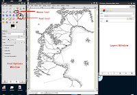
Another note about these image applications programs; all the different elements are added on different layers. You will be doing this for each text item or map element that you add. Yes, it will add to the file size, but in the end you will 'flatten' all the layers into just one single layer.

Also, remember to save your work frequently. We're in the 21st century now and I'm sure all of us knows what happens when you don't save your work!

So let's get busy, shall we?

Click on the Text Tool in the tools pallet. If you click on your map a small window will pop up. Type the text that you want to display in the window. You will see it appear on the map. In the Options Pallet, select the font and size that you want. After you have made your selection, click Close. You'll notice in the layers pallet that the text has now created it's own layer above the map background layer. If you don't see your layers, click on the drop-down menu at the top of the layers window.
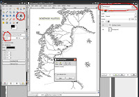
If you need to move the text to a different place on the map, select the Move Tool. In the Options Pallet, select 'Move the active layer'. Select the layer with the text that you want to move and use the Move Tool to move it to a new position on the map.
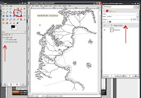

Now, use this method over and over again, adding new text to your maps. A good method is to make the first letter of the word a larger sized font. Unfortunately, in GIMP, this has to be done on a separate layer which might get a little unwieldy. There may be an easier way to do this in GIMP but I haven't found it yet. You will not have that problem if using Photoshop.Now, there's one other thing that I will show you here. You can add additional elements, such as a compass, to you map. You can find one online, scan one in or you can download and use this one I created. Remember, if you look for one online, be sure that it is of a high enough resolution for your map to print properly. To download the compass image, click on the image to the right, when it opens in the window, right click and save image.

Open this Compass file in GIMP (or PS). Then go to 'Select" >> All >> then copy (Edit >> Copy) the image and paste (Edit >> Paste) it into your map file. You won't see it right away but a new layer will be created called "Floating Selection (Pasted Layer)". Double click on that layer name and rename it 'Compass'. You can resize and position the compass using the scale tool and the move tool as needed.
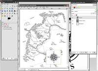
You may notice that the white space around the compass image may be covering up some of your map. What you want to do here is be sure that you have selected the compass layer in the layer window, in the Mode drop down menu, select 'Multiply'. You will notice that the white background will disappear leaving only the black of the image exposed. We will be using this technique a bit more in lesson 4.
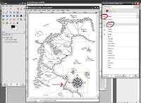
At this map scale, I add dots or squares for cities and ruins.

Now, you map should be looking pretty good. Be sure you have a version of this file saved. Now you will flatten all the layers into one. Do this by right clicking on one of the layers and selecting 'Flatten Image'. Save this version of the file under a different name so that you have both versions to work from just in case you need to alter your layers once again.
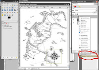
This is a very brief lesson using GIMP to add text to your hand drawn map. I understand that this might be a lot of information but I hope this can get you started with using an image manipulation application to alter your maps. Just be patient and keep working at it.
In the next tutorial, we will be adding color and texture to give your map an old, worn look.
On to Part 4

Thursday, December 17, 2009

Read Me A Story, Please...

This week has proven to be quite busy for me. In fact, posting might be a little lite the next couple of weeks. I'll get back to my map making tutorial and other Warlock posts soon.

But in the meantime....Why not enjoy a little story.


Crawler of the Mists Audio

Don't forget the pictures too!

Friday, December 11, 2009

Fantasy Friday

No one captures the spirit of classic dungeon exploration better than Peter Mullen. Peter Mullen's stylized fantasy art has been a staple of the Old School Revival and his work has been featured on the covers of Fight On! Magazine, Knockspell Magazine, Swords & Wizardry Core Rules and White Box, as well as various other published material. From his paintings, pastels, and pen and ink work, his odd and eerie visions of heroes and monsters burst forth from the page to draw the viewer into the exciting yet deadly atmosphere of treasure filled tombs and outlandish horrors.

Alas, I blab too much when but a few pictures will do what words cannot.

Explore Peter's work now!

Thursday, December 10, 2009

Campaign Creation: Map Making Tutorial Part 2

Hey all you grognards out there, sharpen your pencils 'cause we're starting part two of our map drawing tutorial. You can check out part 1 here if you missed it.

This tutorial will help you Game Masters out there add some style and some finishing touches to your campaign map that you may be handing to your players. Everything at the gaming table could be a prop that helps enhance gameplay and nothing sparks imagination more than an interesting map.

I've seen a lot of campaign maps out there in the interwebz, most of which are very inspiring in many ways. Also many fantasy books come with maps so you can follow the progress of the character's adventures throughout the stories and novels. These are all great inspirations for map features and ideas. Use them!

In this part of the tutorial, we'll be going over 'inking' your penciled map. For this I recommend that you pick up some nice pens to work with. I suggest the Faber Castell pens. You can pick them up at your local art supply store or online. The Faber Castell Black, Fineliner Set of 4 comes with four different widths and goes for about $6.99 per set online. They use a nice black india ink. If you can't find the Faber Castell pens you can go with the black Micron pens. These also come in different widths.

Now, the reason for the different pen widths is that you will use them to create a variety of 'line weights' on your map. It is a very minor detail but adds quite a bit to your finished map. For example, I use a thicker line weight for the coastlines and mountains while most other detail in the map use a thinner pen point.

Let's start with the coastline. I'll use the Faber Castell F (fine) pen and I'll start redrawing over my penciled line. Remember to keep the coastline irregular and jagged. I like to leave little inlets for rivers and bays for coastal towns. Don't forget to outline any islands the same way.
Once you are done with the coastline, I like to add some ripples along the shoreline to give the impression of water. I do that by using the Faber Castell S (super fine) pen. I start by adding a squiggly line along the coast in what would be the ocean or sea. I break the squigglys up so it is a broken line but still follows the contour of the coastline. When I finish with that initial line (remember your islands too) I go back an add a second squiggly line (ripple) following the contour of the first shoreline ripple. I keep this line broken up even more than the first. Again, don't forget your Islands. Note that if islands or land masses are close together, you don't have to squeeze a ripple between them. Just make the ripple go around both pieces of land. The ripples are there just to give the impression of land masses in water.
Now take a look at your work. You should see your well defined coastlines appear to be causing a ripple in water. Your islands should look really nice too. If you have any trouble, just keep working at it. After a few attempts you'll soon start to get the hang of it.

You'll also notice how the line-weights already start to bring some dynamics to your map.Now, on to the mountains. Again, I will be using the Faber Castell F (fine) pen to draw the mountains. The mountains are nothing more than overlapping upside-down 'V's'. Remember to vary the shapes of these upside-down V's a bit too. By the time that you're done inking these you'll wish that you haven't made so many mountain ranges!Once you are done with the mountains, there's one more thing to add to them and for that I will be using the Faber Castell S (super fine) pen once again. What I add now to the mountains is some shading and texture by just adding short strokes, all in the same direction and all on the same side of the mountains. Think of it as if the sun were rising on the right side of the page, the left side of the mountains would be hidden in shadows. I like to use these short strokes but you can add a heavier shadow if you like. You can use the same technique with hills as well.To draw the strokes, I find it easier if I turn the paper so that I 'pull' the lines towards me. It is a bit easier to keep them parallel this way. Vary the lengths of the lines too.Your map should really start to be taking shape at this point. The last thing to add are the rivers. For these I use the Castell S (super fine) pen once again. Remember, there's not may bridges over these rivers that are off the main road becoming an obstacle challenge for your PC's to overcome.

At this scale, I like to add sea-trade routes and major roads. For these I would suggest using The Faber Castell XS (extra super fine) for these elements.

You should have a pretty good looking map at this point!You'll notice that I didn't add any cities or forests yet or lables. I like to add them a bit later and that will be covered in part 3.

Wednesday, December 9, 2009

Fight On Issue 7 Now Available

Just in time for the holidays is Fight On #7. Another great magazine from the OSR filled with classic goodness. But don't take my word for it, read on!

Deep under the misty mountains, the proudest and toughest keep Fighting On! Join us in those days of blood and plunder by picking up a copy of issue 7, dedicated to M.A.R. Barker and featuring EIGHT adventures, tables, settings, reviews, encounters, monsters, spells, magic items, new classes, non-canonical expansions to Empire of the Petal Throne, and much, much more! With art and articles by Akrasia, Mark Allen, Lee Barber, Baz Blatt, Calithena, Jeff Dee, Krista Donnelly, Allan Grohe, Zach Houghton, Gabor Lux, James Maliszewski, Peter Mullen, Stefan Poag, Alex Schroeder, Anthony Stiller, and more, this is one of the most beautiful issues we've produced. Take your game to the next level and buy it today!

You can get the new issue at http://www.lulu.com/content/8047414 .

Table of Contents
Legend of the Dullahan (Matthew Riedel)……………….3
Creepies & Crawlies (Zach Houghton & Douglas Cox).....7
Temple of the Sea Demon (Gabor Lux)…………………9
Knightly Orders (Robert “Treebore” Miller)…………....14
The Shaman (James Maliszewski)………………………16
Thrazar (Steve Zieser)………………………………….19
The Devil’s in the Details: Pé Chói (Baz Blatt)…………20
Former Gnomish Caves (Alex Schröder)……………….25
A Part of the Tsuru’úm (Baz Blatt)……………………..26
Barony of Northmarch (Coffee)…………………….….27
Rad Expanse of the Broken Moon (Brian Isikoff)……...28
Song of Tranquility (Jerry Stratton)………………….…29
Tables for Fables (Age of Fable)……………………….35
Maze Master’s Miscellany (Beaudry, Random, & Rients).36
Grognard’s Grimoire (Ragnorakk & Mistretta)…………37
Beware the Lord of Eyes (Allan T. “Grodog” Grohe)….38
The Forgotten Entity (Geoffrey McKinney)…………....44
Mooning Ixtandraz (Peter Schmidt Jensen)…………….45
Wandering Harlot Table (Adam Thornton)………….…46
From Tekumel’s Underground (Aaron Somerville)……..48
The Search for Lord Chúrisan (Krista Donnelly)……….52
Taking it with you (Lawson Reilly)……………………..61
The Duchy of Briz (Akrasia)…………………….……...63
Darkness Beneath: The Fane of Salicia (Lee Barber)…....66
The Four M’s (Calithena)………………………………77
Critical Misfortune (Clovis Cithog)……………………..78
One Charge Left (Lee Barber)………………………….79
One Time at D&D Camp… (Harnish & Robbins)……..80
Finding Players (James Edward Raggi IV)………….…...82
Merlyn’s Mystical Mirror (various)……………………...85
Artifacts, Adjuncts, & Oddments (Green & Calithena)....88

Front cover by Peter Mullen. Back cover by Brad Johnson. Fight On! and Erol Otus logos by Jeff Rients. M.A.R. Barker photograph by Giovanna Fregni. Interior art and cartography by Mark Allen (portfolio.marjasall.com: 3,5,29,33,37,38,42,44,48,49,56,57,60,62), Matthew Riedel (4,7), Black Blade Publishing (blackbladepublishing.com: 5,37), Dei Games (deigames.com, 6), Anthony Stiller (7,40,41,42,43), Lee Barber (ghosttower.crithitcomics.com: 8 (logo),66,68,71,72,73,74,75,77,79), Kelvin Green (junkopia.net/kelvinsdirtybits/main.html: 8,88), Otherworld Miniatures (otherworld.me.uk: 9), Gabor Lux (10,11,12,13), Bill Hooks (14,15,36), Tita’s House of Games (tekumel.com: 15), Steve Zieser (19), Kesher (23,51,59), Alex Schröder (25,43,54,58,84), Baz Blatt (26), Coffee (27), Brian Isikoff (28), Jerry Stratton (www.godsmonsters.com; 30,31,32,33), Age of Fable (35), Martin “Istarlömé” Gillette (40), Peter Jensen (45,88), Jeff Dee (50), Talzhemir (51), Mikko Torvinen (64), Akrasia (65), Robert S. Conley (66), Ben Robbins (80), James Forest & Larry Whitsel (81), Stefan Poag (84), M.A.R. Barker (85), Joe Wetzel (86), and Eric Bergeron & Rob Kuntz (87).

Tuesday, December 8, 2009

Rob Conley's Supplement VI: The Majestic Wilderlands


Many of the old school blogs have mentioned this already so I wasn't going to. I figured what's the point? Everyone is talking about this much more eloquently than I could. But after reading Jeff Rient's take on it over at Jeff's Gameblog I felt that this item was really starting to pique my interest. Rob Conley's Supplement VI: Majestic Wilderlands sounds to me to be quite the resource for a nice custom piece of gaming. It sounds like there's plenty to plunder or take as is. It's written for Swords & Wizardry but sounds like it can be adapted to most classic style fantasy RPGs. I'm not going to repeat Jeff's take on it, you can read it here, but this is one item that I'll be heading over to Lulu to purchase a print version as soon as it's available.

Monday, December 7, 2009

Campaign Creation: Map Making Tutorial Part 1

I'm going to cover how I created my sandbox campaign setting. None of these ideas may be groundbreaking but there may be a nugget or two in here that someone may find interesting and useful. I know that I've gained a ton from the various blogs and forums on the interwebz and hopefully this will be another piece in that mosaic.

Everyone will have their own methods and philosophies on campaign creation. No two campaigns are created alike and that's the way it should be. It should be a fun and creative process and not something tedious.

It's best to start by identifying your strengths and weaknesses and where you may want to challenge yourself as a GM. For me, I like to create maps. It's enjoyable and I don't consider it work at all. Populating that map with cities and encounters is another story. I can come up with dungeons and towns to populate my empires and kingdoms when I need to but, for me, that is sometimes too time intensive. I pull a lot of those elements from other resources and piece it all together.

A challenge for me is coming up with random encounters. I know that may sound like an easy task for some, but for whatever reason it always bogs me down. I'm always impressed with many of the encounter tables that I've found online or in supplements that others posted for download. So that will be something that I'll be focusing on; creating some interesting encounter tables. There are many great bloggers out there and forums that come up with great encounter lists or ideas. They're a great source for inspiration and I'll be using those as I go along and I'll be mixing and matching those as well.

I don't mind pulling as much material from other sources as possible and plugging them into my campaign. In fact, you might say that is what the original designers of the game intended; a flexible campaign creation system. Why do you think that the early adventures were called modules? So you can plug them into your campaign as needed. My methods involve a 'found art' collage concept. I create the parts that I enjoy then plug in the rest from other sources.

Now I'm not into total world building, detailing every major NPC, Kingdom, encounter, etc, I leave that up to game play. Your players will help define the campaign setting if you let them, and I say let them. Why do all the work yourself. In a sandbox campaign, broad-strokes are all you need. You can flesh things out between sessions or on the fly. Granted, that takes some flexibility on the part of the GM and I think that is a great skill for any GM to have and cultivate.

When I started my sandbox campaign concept the first thing that I worked on was the map. Other GameMasters may start in any number of ways, perhaps with some important NPCs or waring city-states and a bit of intrigue, or maybe it's just a megadungeon crawl. There is no single way to create a campaign. It's what ever you like or what ever strikes your fancy.

I began with some rough sketch layouts on 8 1/2 X 11 sheet of paper of the general regions and kingdoms and then refined it as I went along. As I'm working in this stage, a broad-stroke of the kingdoms and realms begins to emerge in my mind. Nothing detailed, just very general ideas of brief histories and perhaps some names.

After I get a sketch that I'm pretty happy with I start to refine it. I usually start with a coast line and mountain ranges. I like my worlds to have a bit of logic to them, for example, rivers flow down from the mountains to the seas, settlements and trade routes will appear along these rivers and along the coasts, farming communities in the plains or hills. Coastlines should be very irregular. Again, create whatever world you want. The standard rules don't have to apply either, magic can change and bend the laws of physics however you wish your setting to be. Feel free to create anything you want.

My next post will talk about detailing and inking the map.

On to part 2

Friday, December 4, 2009

Fantasy Friday

This Friday I'm taking a step slightly outside of classic D&D.

I've been reading the rules for the original Gamma World and taking a look at Goblinoid Games' Mutant Future. There's a lot of interesting things there that I'll chat about in future posts. Anyway, theses images head in that Mutant Future, Gamma World direction featuring the infinite creative mind of Jack (The King) Kirby. And if you're looking for any mutant world inspiration, Kamandi is a great place to start!

You can probably find many of the back issues on the interwebz but DC comics has put together a nice Kamandi collection of Kirby's far-out stories.

Wednesday, December 2, 2009

B9 Castle Caldwell

Players be warned - Spoilers Ahead!

The B9 module, Castle Caldwell and Beyond, in my opinion, may not have been one of TSR's most creative modules. Having come out in 1985, it was after I had stopped gaming and moved on to other things. I never owned the actual module but I did pick up some of these included adventures in the B1-9 collection, In Search Of Adventure.

The module itself was a series of five loosely connected adventures for beginning players using the Moldvay Basic Rules. The entire concept was not a bad idea as it could easily be turned into a mini campaign, however the execution of the adventures left a lot to be desired.

Now I don't consider the the first adventure of Castle Caldwell itself to be that awful. It's a basic hack-n-slash clear the castle scenario, and there are some elements that one could expand upon; the evil cleric for one and the thieves can be used for some role-playing. The one thing that kills this adventure is the very un-inspiring castle map (see above map). I've always hated that layout and seemed to me to be unimaginative, dull, and unrealistic.

So what to do? Make your own map.

So this is the map I came up with for the main level of Castle Caldwell. First off, you'll notice that I got rid of the boring box corridor and the rearranged the monotonous rooms and doors, I split the 30+ rooms into two levels, I removed some of the repetitive empty rooms and finally I added an additional room or two to pad things out. I've also combined a couple of the rooms and you will see these numbers on the map divided by a slash. In this case, combine both room descriptions into one making the various changes required. You can click on the image to the right to view and then download the large map if you are interested.

For obvious copyright reasons, I cannot post the contents of the module here. If you have the module or the In Search of Adventure booklet, you can match the room numbers up with the room descriptions, I use the same numbers on my map. You will have to use your common sense and make various changes to the descriptions in the existing module to adapt to the new map, for example, light coming in from windowed walls, the shelves in the current room descriptions, etc.

I feel that this adds a bit more variety to the map layout.

I have added additional room descriptions below that I felt may be useful.

ADDITIONAL DESCRIPTIONS

GROUND LEVEL

The outside entrance is a grand pair of ornately carved heavy oak doors with iron rings door handles. The doors are not locked and open inward into the grand hall.

AA. GRAND HALL - The light from the outside streams through the front door and into a grand hall; a 60' X 40' room with oak doors in the center of the east and west wall, with two doors in the east and west corners of the north wall and a pair of double doors, 8 feet tall in the center of the north wall. On either side of those doors are two tapestries aged and worn and in tatters hanging from the wall. Inlaid in stone upon the center of the floor is a crest of a blue shield and a white sash running diagonal. The top portion of the shield there is a castle and the bottom half has a dragon. On either side of the entrance doors are steps the lead up to a 10' wide balcony held up by four stone pillars that run along the east and west walls respectively. The ceiling is vaulted over thirty feet above your heads.

The tapestries show two dragons facing each other. They are in tatters due to age and neglect and are worthless.

There is nothing of value in this room.

1. DINNING ROOM - This room appears to have once been used as a dining room. There are two long wooden banquet tables and numerous chairs and benches strewn about the room. Scattered on the tables are a number of eating utensils, forks, knives and spoons along with wooden bowls and metal plates. 15 feet above the floor is a 5 foot wide balcony running the perimeter of the room (CC). Everything is covered with dust and cobwebs.

In one corner of the room is a pile of chairs that look more placed than randomly tossed about. There is a sack that contains 500 sp and three gems, one worth 300 gp and two worth 50 gp. The gems cannot be seen unless the contents of the sack are dumped out.

6, 12, 20 TOWER ROOMS - This the base floor of the tower. There is a spiral staircase in the center of the room which ends at a wooden trap door in the ceiling. There are ports spread throughout the walls for arrows to be fired. The room appears to be empty.

31 TOWER ROOMS - Two very hungry wolves lunge and attack the party.

This the upper floor of the tower. There is a spiral staircase in the center of the room which down to the ground floor and up to end at a wooden trap door in the ceiling. There are bones of two tiny humanoid creatures on the floor.

UPPER LEVEL

14. TOWER ROOM - This the upper floor of the tower. There is a spiral staircase in the center of the room which down to the ground floor and up to end at a wooden trap door in the ceiling. The room appears to be empty.

A crab spider is clinging to the ceiling when the party enters, and drops down on a party member (choose at random), surprising on a roll of 1-4 on a 1d6. If the crab spider makes a successful hit, the victim takes normal damage and must then make a saving throw vs. Poison (at +2 because the spider's poison is weak) or die.

The trap door leads up to the roof which is empty.

BB. GRAND HALL TERRACE - The balcony over looks the grand hall (see description for room 1 The Grand Hall).

31A - There is a 40% chance that the wolves in room 31 will be on this level and immediately attack. Otherwise it will take the wolves 2 round to move from the upper level down to the ground level and attack.

CC. DINNING ROOM TERRACE - A balcony over looks the Dinning Room (1). The secret door to DD can only be accessed with the key found in room 10.

DD. TROPHY ROOM - The trophy room can only be accessed by using the key in room 10 to open either one of the secret doors. Inside the room are treasures and trophies from the original inhabitants. The GM in encouraged to populate this room with treasure and monsters appropriate to his/her imagination or campaign.

I know this may not be the best way to present an update to an existing adventure but I hope it does help spark some imagination.

On a further note, the lower levels of Castle Caldwell, in my opinion are not that great either, but instead of recreating that portion, the pit beyond the locked door in room 21 leads to the Store Room level and the beginning of the Castle of the Mad Archmage adventure written by Joseph Block over at Greyhawk Grognard.